import numpy as np
import pandas as pd
import matplotlib.pyplot as plt
import joypy
# Create realistic temperature distributions
np.random.seed(42)
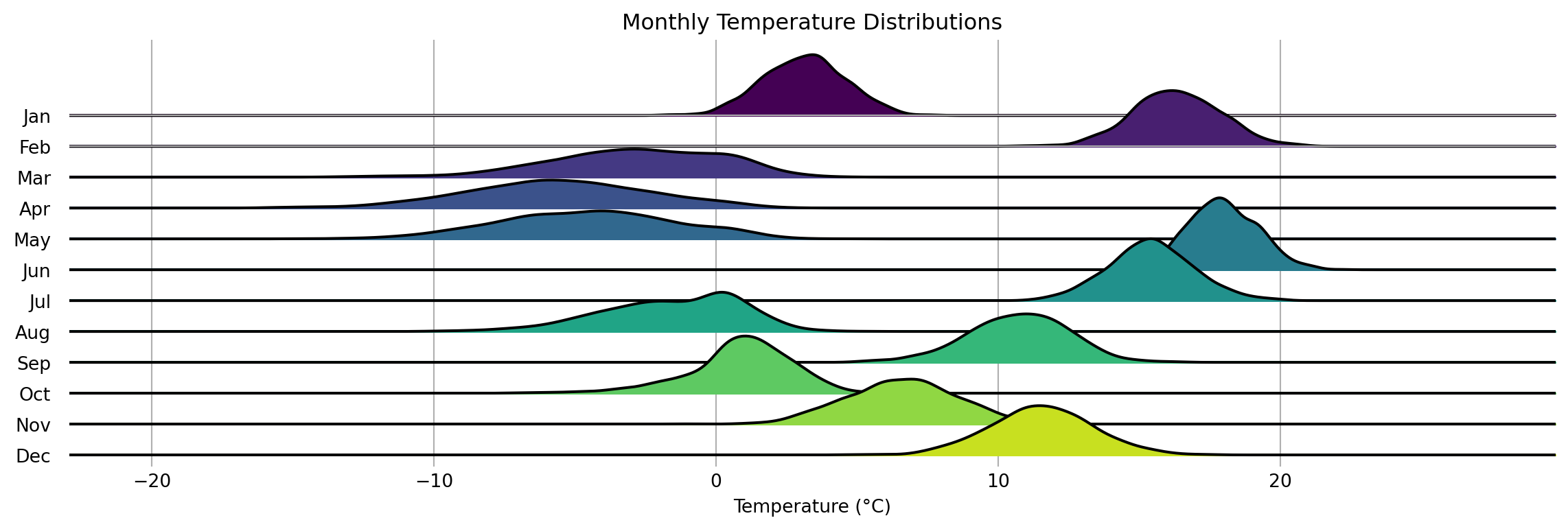
months = ['Jan', 'Feb', 'Mar', 'Apr', 'May', 'Jun', 'Jul', 'Aug', 'Sep', 'Oct', 'Nov', 'Dec']
data = []
# Temperature parameters for Helsinki, Finland (as an example)
mean_temps = [
-3.5, # Jan
-4.5, # Feb
-1.0, # Mar
4.5, # Apr
10.8, # May
15.5, # Jun
18.0, # Jul
16.3, # Aug
11.5, # Sep
6.6, # Oct
1.6, # Nov
-2.0 # Dec
]
# Winter months have more variance than summer months
variances = [
2.5, # Jan
2.5, # Feb
2.2, # Mar
2.0, # Apr
1.8, # May
1.5, # Jun
1.2, # Jul
1.5, # Aug
1.8, # Sep
2.0, # Oct
2.2, # Nov
2.5 # Dec
]
for month, mean_temp, variance in zip(months, mean_temps, variances):
# Add some random noise to make it more natural
distribution = np.random.normal(loc=mean_temp, scale=variance, size=1000)
# Add slight skewness to winter months (more extreme cold than warm days)
if mean_temp < 5:
distribution = distribution - 0.3 * np.abs(distribution)
data.append(pd.DataFrame({
'temperature': distribution,
'month': month
}))
df = pd.concat(data, ignore_index=True)
# Create the ridgeline plot
joypy.joyplot(
data=df,
by="month",
column="temperature",
colormap=plt.cm.viridis,
title="Monthly Temperature Distributions",
labels=months,
range_style='all',
tails=0.2,
overlap=0.7,
grid=True,
figsize=(12, 4)
)
plt.xlabel("Temperature (°C)")
plt.show()