orders[orders["zone"] == "Nord"]| order_id | zone | items | total_eur | |
|---|---|---|---|---|
| 0 | 101 | Nord | 2 | 18.5 |
| 2 | 103 | Nord | 3 | 24.0 |
Programming with Python
Friday, the boardroom. Picture it: the investor slides a pencil out of her jacket and sharpens it while you set up, the sound louder than it has any right to be.
Last week you handed her a table she could trust. She read exactly one row, looked up, and said the thing this whole session is about:
“Tables are homework. Charts are arguments.”
A number convinces the careful. A picture convinces the room. Today: draw the right chart for the question, and refuse to draw a misleading one.
Everyone plots with matplotlib, imported as plt. Four lines turn a list of numbers into a picture:
import matplotlib.pyplot as plt

days = [1, 2, 3, 4, 5]
revenue = [120, 90, 140, 160, 130]

plt.figure()          # OPEN: a fresh canvas, so this chart
                      #       doesn't draw on the last one
plt.plot(days, revenue)   # x, then y
plt.title("This week's revenue")
plt.gca()             # SHOW: "get current axes" (the chart)
Two habits for every chart cell: open with plt.figure() (a clean canvas) and end with plt.gca(). In marimo there’s no plt.show(); the figure appears as the cell’s last expression, and plt.plot(...) alone returns line objects, not a picture. Today’s lab is a script without cells, so there a chart ends in a picture file. More on that before the break.
Tobi is in a hurry and hands plot one list, no days:
plt.plot([3, 5, 4])What does the x-axis show?
a) 3, 5, 4, the values themselves b) 0, 1, 2, the list positions c) 1, 2, 3, counted the human way
Predict. Pick a letter, then I reveal the answer.
import matplotlib.pyplot as plt

plt.figure()
plt.plot([3, 5, 4], marker="o")
plt.xticks([0, 1, 2])   # show only whole positions
plt.gca()
b) 0, 1, 2: with one list, matplotlib takes it as y and invents x as the positions, and Python counts positions from 0.
Want days 1-5 on the axis? Pass them: plt.plot(days, revenue), x first.
Every chart names its axes. xlabel, ylabel, title, and (when there’s more than one line) a legend:
import matplotlib.pyplot as plt

days = [1, 2, 3, 4, 5]
revenue = [120, 90, 140, 160, 130]

plt.figure()
plt.plot(days, revenue, label="Revenue")   # label feeds the legend
plt.xlabel("Day")        # what the x-axis counts
plt.ylabel("Revenue (€)")  # what the y-axis measures
plt.title("This week's revenue")  # what the picture is about
plt.legend()             # the little key, one entry per label
plt.gca()
Scan the QR or type the link:
python.tobiasvlcek.com/notebooks/ex_09_a/

Any questions? Let me know!
Two keywords cover almost everything: color and linestyle. Restraint is the professional move. One clear line beats a rainbow:
import matplotlib.pyplot as plt

days = [1, 2, 3, 4, 5]
revenue = [120, 90, 140, 160, 130]

plt.figure()
plt.plot(days, revenue, color="crimson", linestyle="--")
plt.title("Styled, not decorated")
plt.gca()
Tobi runs two plot calls, back to back, with no plt.figure() between them:
plt.plot([3, 1, 2])
plt.plot([1, 2, 3])
a) one chart with two lines b) two separate charts, one per call c) an error: the figure is already in use
Predict. Pick a letter, then I reveal the answer.
import matplotlib.pyplot as plt

plt.figure()
plt.plot([3, 1, 2])
plt.plot([1, 2, 3])   # same canvas: a second line, not a second chart
plt.gca()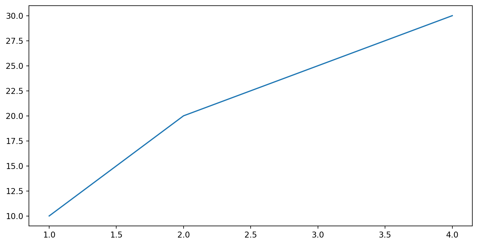
a) one chart with two lines, because matplotlib keeps drawing on the current figure until you start a new one with plt.figure().
That’s exactly why every chart cell opens with plt.figure(): it’s how you say “new picture, start clean.”
Scan the QR or type the link:
python.tobiasvlcek.com/notebooks/ex_09_b/

Any questions? Let me know!
The wrong chart is its own kind of lie. Start from the question, not the chart:
| The question | The chart | The call |
|---|---|---|
| Compare categories? | bar | plt.bar(labels, heights) |
| See a distribution? | histogram | plt.hist(values) |
| Two numbers per order? | scatter | plt.scatter(x, y) |
| Change over time? | line | plt.plot(x, y) |
Line you already own from block one. Missing on purpose: the pie chart. The eye can’t compare slice sizes; a bar is clearer.
“Which dish sells best?” Categories to compare, so that’s a bar:
import matplotlib.pyplot as plt

dishes = ["Pizza", "Pasta", "Salad", "Wrap"]
sold = [12, 9, 5, 7]

plt.figure()
plt.bar(dishes, sold)
plt.title("Orders per dish")
plt.gca()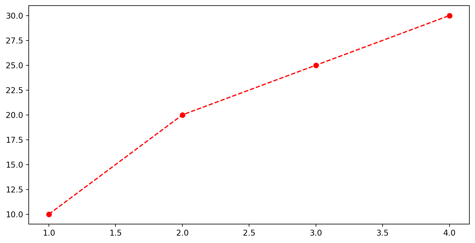
The tallest bar answers the question at a glance: Pizza.
“How are our delivery times spread out?” One column of numbers dropped into buckets. That’s a histogram:
import matplotlib.pyplot as plt

minutes = [19, 22, 23, 24, 24, 25, 26, 28, 31, 44]

plt.figure()
plt.hist(minutes, bins=5)
plt.title("Delivery times")
plt.gca()
Most deliveries land in the mid-20s, with one lonely slow one far right. A histogram shows shape, not individual values.
“Do bigger orders take longer?” Two numbers per order, one on each axis, which makes it a scatter:
import matplotlib.pyplot as plt

minutes = [19, 22, 23, 24, 25, 26, 28, 31, 40, 44]
euros   = [24, 9, 31, 12, 8, 30, 15, 22, 11, 19]

plt.figure()
plt.scatter(minutes, euros)
plt.xlabel("Delivery time (min)")
plt.ylabel("Order value (€)")
plt.gca()
Just a cloud. No upward drift. Sometimes the answer is “there’s no pattern here.”
Tobi types plot where he meant scatter. Five orders, in the order they came in:
minutes = [31, 19, 44, 22, 28]
euros   = [22, 24, 19, 9, 15]
plt.plot(minutes, euros)
a) a zig-zag line hopping between the points in list order b) the same dots as scatter, joined into a smooth trend c) an error: plot refuses x values that are not sorted ascending
Predict. Pick a letter, then I reveal the answer.
import matplotlib.pyplot as plt

minutes = [31, 19, 44, 22, 28]
euros   = [22, 24, 19, 9, 15]

plt.figure()
plt.plot(minutes, euros, marker="o")   # joined in LIST order
plt.gca()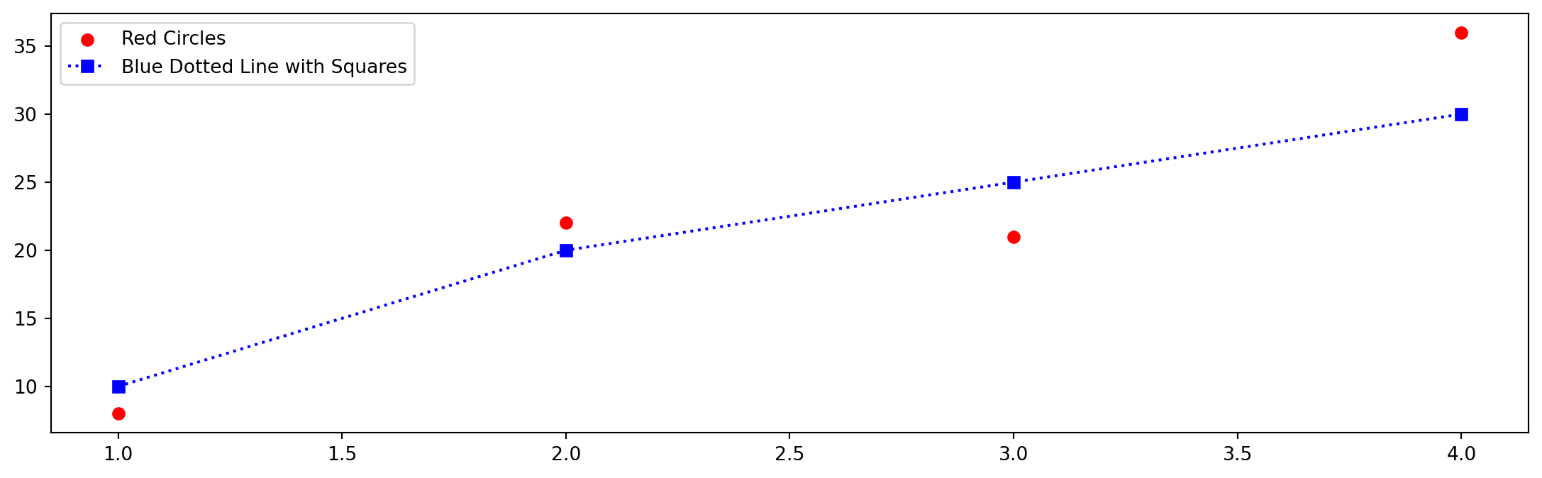
a) a zig-zag: plot connects the points in the order you gave them, never mind the x values. Order 1 to order 2 to order 3, back and forth.
A line says the points follow each other, and orders don’t. Two numbers per order with no sequence between them is a job for scatter.
The same four numbers, two ways. On the left, a bar per number; on the right, a histogram:
values = [8, 12, 9, 15]
plt.bar(range(4), values)   # left
plt.hist(values, bins=3)    # right
The bar chart shows 4 bars. How many bars does the histogram show?
a) 4: one bar per number b) 15: one bar per unit up to the max c) about 2-3 lumps: it counts ranges
Predict. Pick a letter, then I reveal the answer.
import matplotlib.pyplot as plt

values = [8, 12, 9, 15]

plt.figure()
plt.subplot(1, 2, 1)
plt.bar(range(4), values)     # one bar per NUMBER
plt.title("bar: 4 categories")
plt.subplot(1, 2, 2)
plt.hist(values, bins=3)      # counts how many per RANGE
plt.title("hist: 3 ranges")
plt.gca()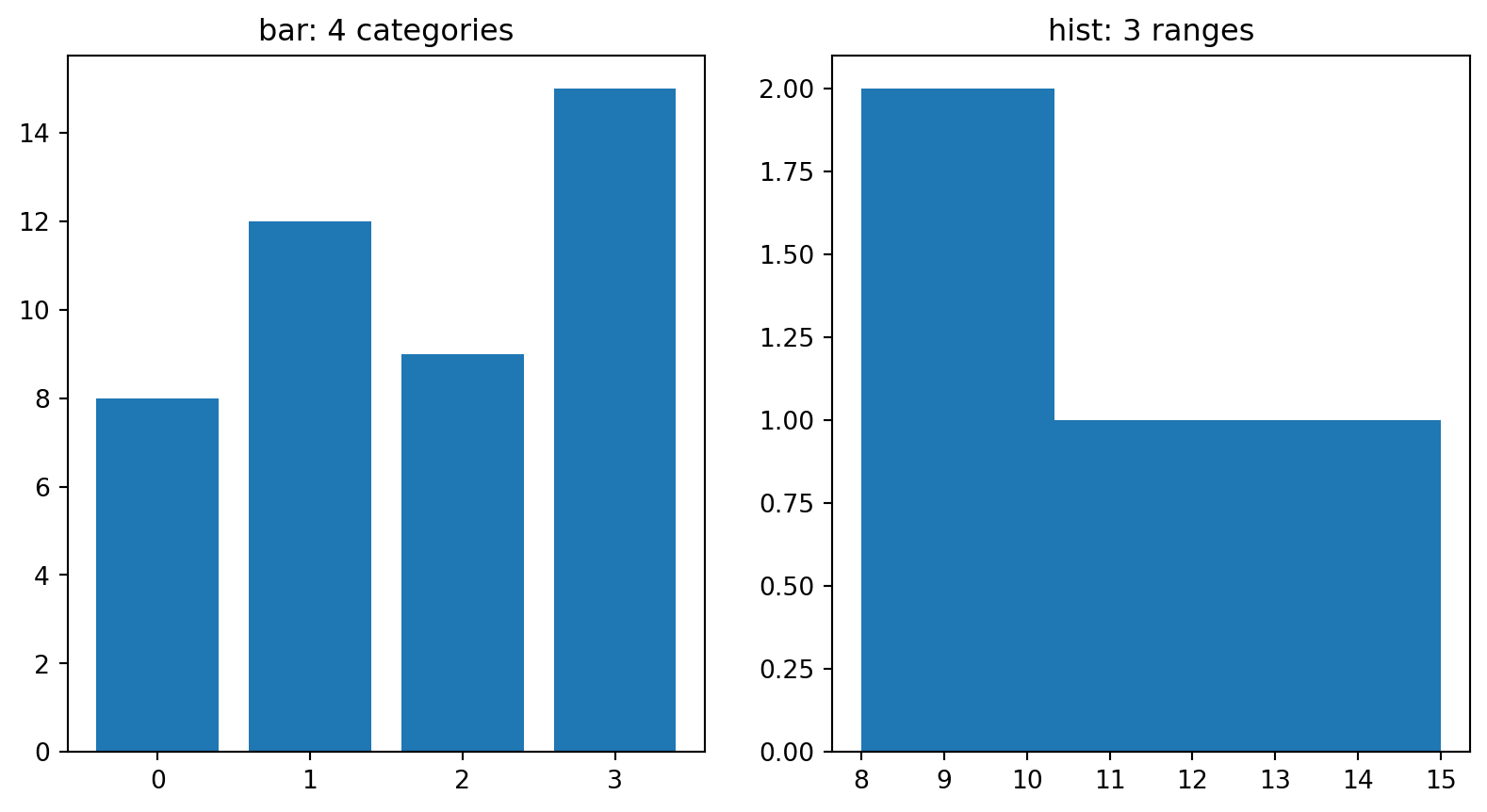
c) about 2-3 lumps: the histogram counts how many numbers fall in each range. 8 and 9 land in the same bucket, so that bar is two tall.
Bar counts CATEGORIES; histogram counts RANGES. Same numbers, different question.
Scan the QR or type the link:
python.tobiasvlcek.com/notebooks/ex_09_c/

Any questions? Let me know!
A five-minute pause after this one, then the axis and the AI chart assistant.
Four weeks of revenue, [96, 98, 97, 99], barely moving. Where the y-axis starts decides: left gets you a term sheet, right gets you trusted. Same numbers, and the room sees a rocket or the truth:
import matplotlib.pyplot as plt

weeks = [1, 2, 3, 4]
revenue = [96, 98, 97, 99]

plt.figure()
plt.subplot(1, 2, 1)
plt.plot(weeks, revenue, marker="o")
plt.ylim(96, 99)             # tight: DRAMA
plt.title("Rocket (ylim 96-99)")
plt.subplot(1, 2, 2)
plt.plot(weeks, revenue, marker="o")
plt.ylim(0, 100)             # from zero
plt.title("From 0")
plt.gca()
Revenue [710, 718, 724, 731], up 3 % over four weeks. Tobi’s AI drafts the chart and adds one line:
plt.plot([1, 2, 3, 4], [710, 718, 724, 731])
plt.ylim(700, 735)
What does the room see?
a) a flat line: 3 % stays 3 % on any axis b) an error: ylim has to include zero on a line chart c) a line climbing almost the whole chart height
Predict. Pick a letter, then I reveal the answer.
import matplotlib.pyplot as plt

plt.figure()
plt.plot([1, 2, 3, 4], [710, 718, 724, 731], marker="o")
plt.ylim(700, 735)   # 3 % of growth, 60 % of the chart
plt.gca()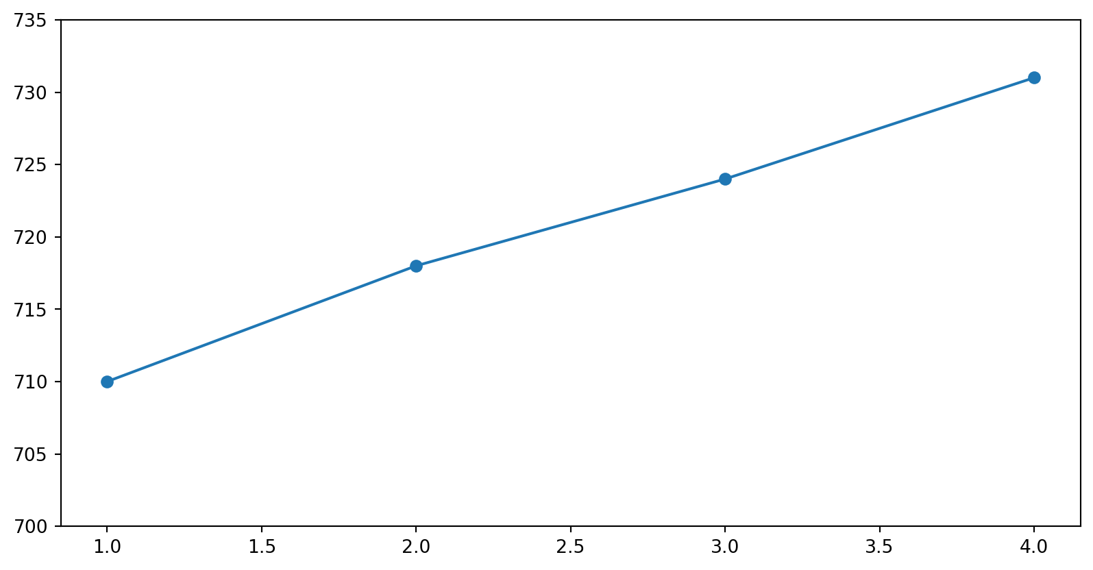
c) a climb across the chart: the axis spans 35 units and the line rises 21 of them, 60 % of the picture for 3 % of growth.
Python raises no error and no warning here. The code is fine; the axis is what misleads.
She’s the type who reads Formular 27b/6 for fun. A stretched axis is the first thing she catches, and the last thing you want to explain.
Scan the QR or type the link:
python.tobiasvlcek.com/notebooks/ex_09_d/

Any questions? Let me know!
AI is good at plotting code, if you check the result:
orders with columns zone (text) and total_eur (float). Bar chart of total revenue per zone.”AI drafts. You decide what goes on the slide.
orders["revenue"], but your column is total_eur: a KeyError, exactly the confident-nonsense you caught in Episode 8. Read the code before you run it.Both threads, one rule: an AI chart runs long before it’s true. You verify the columns and the axis, every time.
Scan the QR or type the link:
python.tobiasvlcek.com/notebooks/ex_09_e/

Any questions? Let me know!
The lab is a script, and a script has no cell that could show a chart. So every chart goes into a picture file:
plt.figure()                 # OPEN: a fresh canvas, as before
plt.plot(days, revenue)
plt.title("This week's revenue")
daily_chart = plt.gca()      # KEEP: the chart, for the lab's checks
plt.savefig("daily.png")     # SAVE: the picture, into python-labs
plt.close()                  # CLOSE: the canvas
Forget plt.close() and the next chart draws on top of this one: one canvas, two charts. To look at the picture, click daily.png in Zed’s project panel, the file list on the left.
lab_09_pitch.py from Episode 9: The Pitch Deck into python-labs. orders_messy.csv is still therepitch_deck.pngShow me pitch_deck.png and the last block before you leave, for feedback as last week. Then two minutes of practice for Checkpoint 5, which is still handed in from the browser: open ex_09_e, Cmd/Ctrl+S, menu → Download → Download Python code, find the file.
plt.figure(), close with plt.gca() (in a script: savefig, then close); label the axes and title it. A chart nobody can read argues nothing.Season finale next: git and the project kickoff. Install git and gh this week. Session X needs them right after the checkpoint.
Building charts with AI this session? Revisit the AI Tools page: describe-then-verify is the whole workflow. Matplotlib’s own pyplot tutorial is a friendly next step.
For more, see the literature list of this course.