Lecture IX - Data Visualization
Programming with Python
Kühne Logistics University Hamburg - Fall 2026
EP 9: The Pitch Deck
Charts are arguments
Friday, the boardroom. Picture it: the investor slides a pencil out of her jacket and sharpens it while you set up, the sound louder than it has any right to be.
Last week you handed her a table she could trust. She read exactly one row, looked up, and said the thing this whole session is about:
“Tables are homework. Charts are arguments.”
A number convinces the careful. A picture convinces the room. Today: draw the right chart for the question, and refuse to draw a misleading one.
Warm-up
Question 1
Three questions from Episode 8. Commit. Hands up before the reveal.
returns…
a) a True/False column b) only the Nord rows c) an error from comparing text
Answer 1
| order_id | zone | items | total_eur | |
|---|---|---|---|---|
| 0 | 101 | Nord | 2 | 18.5 |
| 2 | 103 | Nord | 3 | 24.0 |
b) only the Nord rows: the True/False column is what the inner expression orders["zone"] == "Nord" makes. Wrapped in orders[...], that mask keeps the rows where it’s True and drops the rest.
Question 2
Tobi’s AI wrote this. orders is a normal DataFrame. What happens?
a) a summary table b) an empty DataFrame c) an AttributeError
Answer 2
AttributeError: 'DataFrame' object has no attribute 'summarize'
c) AttributeError: pandas has .describe(), not .summarize(). The AI invented a plausible name. An AI that sounds sure is not the same as an API that exists. You verify, every time.
Question 3
shows…
a) the first five rows of the column, like .head() b) count / mean / std / min / quartiles / max c) the column’s dtype, like .dtypes
Answer 3
count     5.000000
mean     17.580000
std      10.688873
min       6.800000
25%       7.200000
50%      18.500000
75%      24.000000
max      31.400000
Name: total_eur, dtype: float64
b) count / mean / std / min / quartiles / max. One line, the column’s whole statistical fingerprint. That’s the real method Tobi’s AI was reaching for.
The first chart
Matplotlib in four lines
Everyone plots with matplotlib, imported as plt. Four lines turn a list of numbers into a picture:
Two habits for every chart cell: open with plt.figure() (a clean canvas) and end with plt.gca(). In marimo there’s no plt.show(); the figure appears as the cell’s last expression, and plt.plot(...) alone returns line objects, not a picture. Today’s lab is a script without cells, so there a chart ends in a picture file. More on that before the break.
Matplotlib in four lines
Predict: what’s on the x-axis?
Tobi is in a hurry and hands plot one list, no days:
What does the x-axis show?
a) 3, 5, 4, the values themselves b) 0, 1, 2, the list positions c) 1, 2, 3, counted the human way
Predict. Pick a letter, then I reveal the answer.
Answer: the positions, from zero
b) 0, 1, 2: with one list, matplotlib takes it as y and invents x as the positions, and Python counts positions from 0.
Want days 1-5 on the axis? Pass them: plt.plot(days, revenue), x first.
Answer: the positions, from zero
The parts of a chart
Every chart names its axes. xlabel, ylabel, title, and (when there’s more than one line) a legend:
import matplotlib.pyplot as plt

days = [1, 2, 3, 4, 5]
revenue = [120, 90, 140, 160, 130]

plt.figure()
plt.plot(days, revenue, label="Revenue")   # label feeds the legend
plt.xlabel("Day")        # what the x-axis counts
plt.ylabel("Revenue (€)")  # what the y-axis measures
plt.title("This week's revenue")  # what the picture is about
plt.legend()             # the little key, one entry per label
plt.gca()
The parts of a chart
Your turn
Open the exercise
Scan the QR or type the link:
python.tobiasvlcek.com/notebooks/ex_09_a/

Any questions? Let me know!
A little styling: and only a little
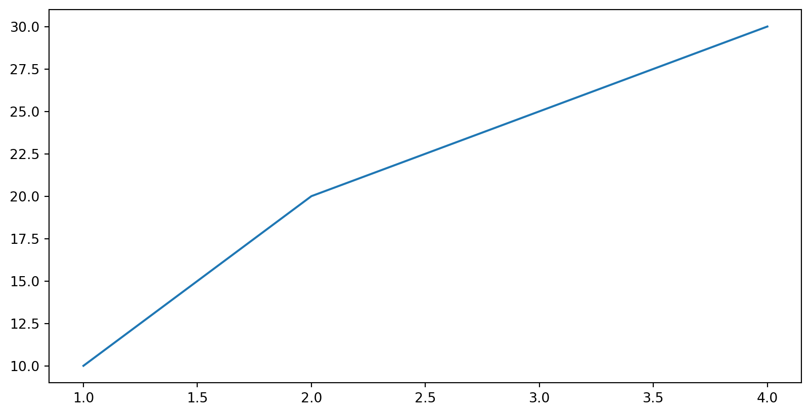
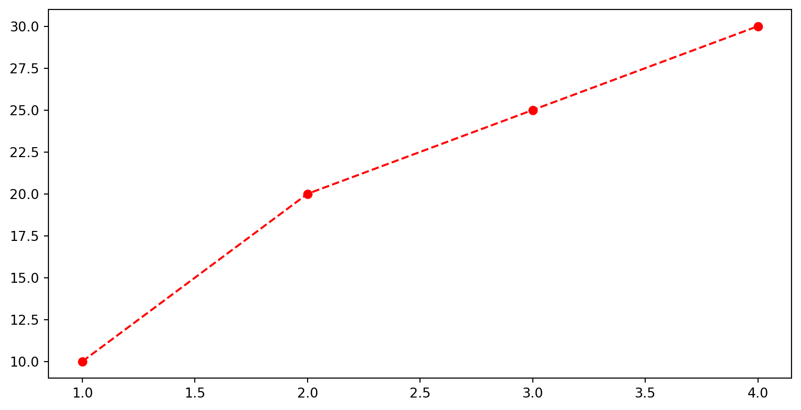
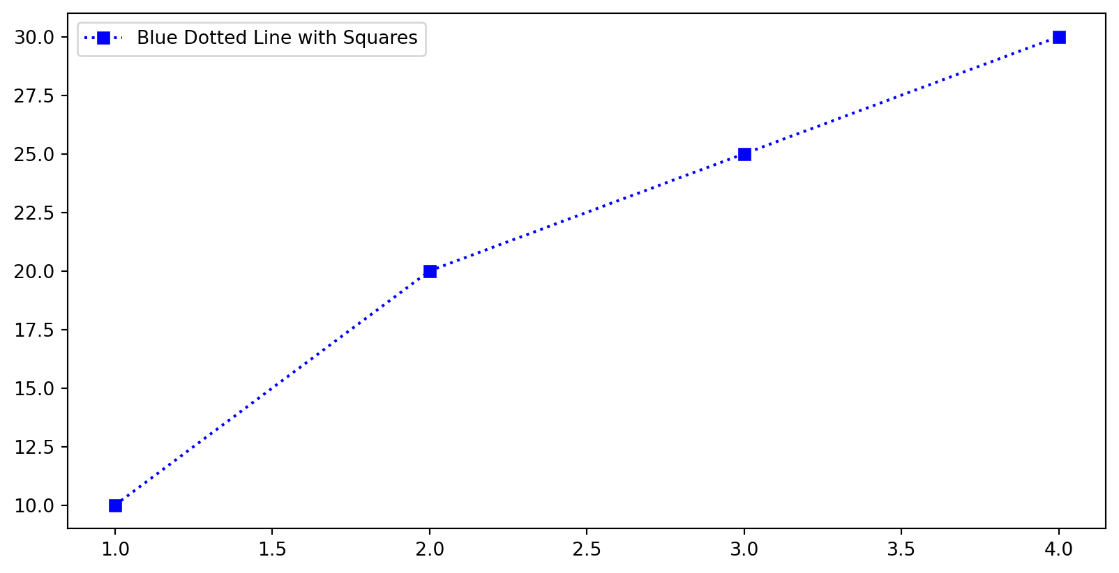
Two keywords cover almost everything: color and linestyle. Restraint is the professional move. One clear line beats a rainbow:
A little styling: and only a little
Predict: one chart or two?
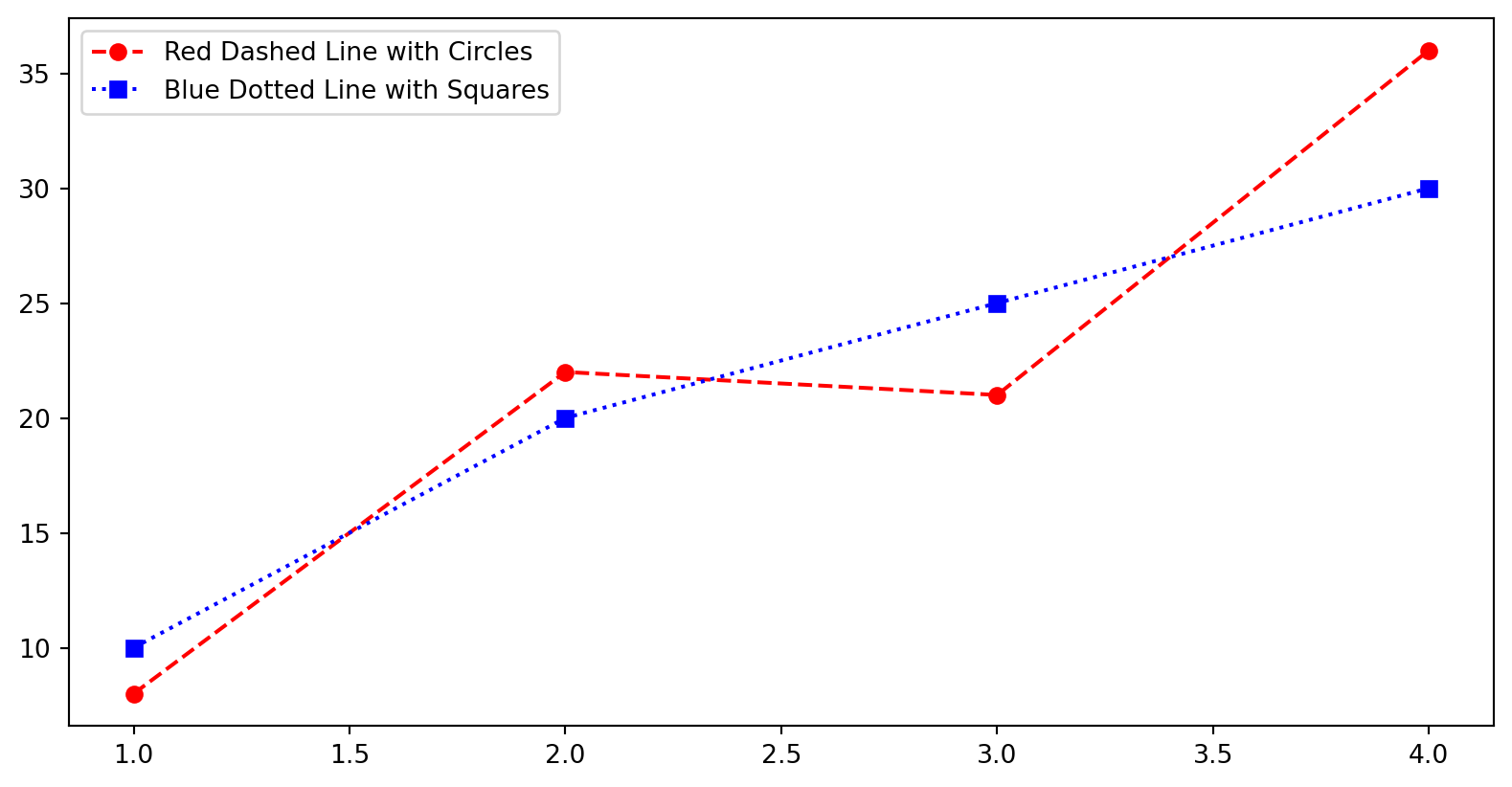
Tobi runs two plot calls, back to back, with no plt.figure() between them:
a) one chart with two lines b) two separate charts, one per call c) an error: the figure is already in use
Predict. Pick a letter, then I reveal the answer.
Answer: one chart, two lines
a) one chart with two lines, because matplotlib keeps drawing on the current figure until you start a new one with plt.figure().
That’s exactly why every chart cell opens with plt.figure(): it’s how you say “new picture, start clean.”
Answer: one chart, two lines
Your turn
Open the exercise
Scan the QR or type the link:
python.tobiasvlcek.com/notebooks/ex_09_b/

Any questions? Let me know!
The right chart
Match the chart to the question
The wrong chart is its own kind of lie. Start from the question, not the chart:
| The question | The chart | The call |
|---|---|---|
| Compare categories? | bar | plt.bar(labels, heights) |
| See a distribution? | histogram | plt.hist(values) |
| Two numbers per order? | scatter | plt.scatter(x, y) |
| Change over time? | line | plt.plot(x, y) |
Line you already own from block one. Missing on purpose: the pie chart. The eye can’t compare slice sizes; a bar is clearer.
Categories → bar
“Which dish sells best?” Categories to compare, so that’s a bar:
The tallest bar answers the question at a glance: Pizza.
Categories → bar
A distribution → histogram
“How are our delivery times spread out?” One column of numbers dropped into buckets. That’s a histogram:
Most deliveries land in the mid-20s, with one lonely slow one far right. A histogram shows shape, not individual values.
A distribution → histogram
Two numbers → scatter
“Do bigger orders take longer?” Two numbers per order, one on each axis, which makes it a scatter:
Just a cloud. No upward drift. Sometimes the answer is “there’s no pattern here.”
Two numbers → scatter
Predict: plot instead of scatter
Tobi types plot where he meant scatter. Five orders, in the order they came in:
a) a zig-zag line hopping between the points in list order b) the same dots as scatter, joined into a smooth trend c) an error: plot refuses x values that are not sorted ascending
Predict. Pick a letter, then I reveal the answer.
Answer: a zig-zag in list order
a) a zig-zag: plot connects the points in the order you gave them, never mind the x values. Order 1 to order 2 to order 3, back and forth.
A line says the points follow each other, and orders don’t. Two numbers per order with no sequence between them is a job for scatter.
Answer: a zig-zag in list order
Predict: how many bars?
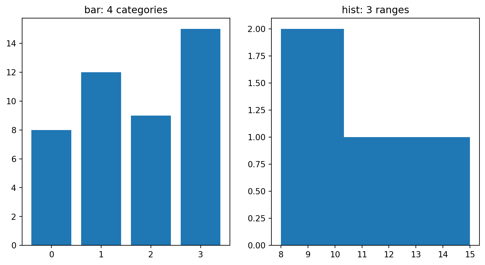
The same four numbers, two ways. On the left, a bar per number; on the right, a histogram:
The bar chart shows 4 bars. How many bars does the histogram show?
a) 4: one bar per number b) 15: one bar per unit up to the max c) about 2-3 lumps: it counts ranges
Predict. Pick a letter, then I reveal the answer.
Answer: about 2-3 lumps
c) about 2-3 lumps: the histogram counts how many numbers fall in each range. 8 and 9 land in the same bucket, so that bar is two tall.
Bar counts CATEGORIES; histogram counts RANGES. Same numbers, different question.
Answer: about 2-3 lumps
Your turn
Open the exercise
Scan the QR or type the link:
python.tobiasvlcek.com/notebooks/ex_09_c/

Any questions? Let me know!
A five-minute pause after this one, then the axis and the AI chart assistant.
The honest axis
The same data, told two ways
Four weeks of revenue, [96, 98, 97, 99], barely moving. Where the y-axis starts decides: left gets you a term sheet, right gets you trusted. Same numbers, and the room sees a rocket or the truth:
import matplotlib.pyplot as plt

weeks = [1, 2, 3, 4]
revenue = [96, 98, 97, 99]

plt.figure()
plt.subplot(1, 2, 1)
plt.plot(weeks, revenue, marker="o")
plt.ylim(96, 99)             # tight: DRAMA
plt.title("Rocket (ylim 96-99)")
plt.subplot(1, 2, 2)
plt.plot(weeks, revenue, marker="o")
plt.ylim(0, 100)             # from zero
plt.title("From 0")
plt.gca()
The same data, told two ways
Predict: the AI’s one extra line
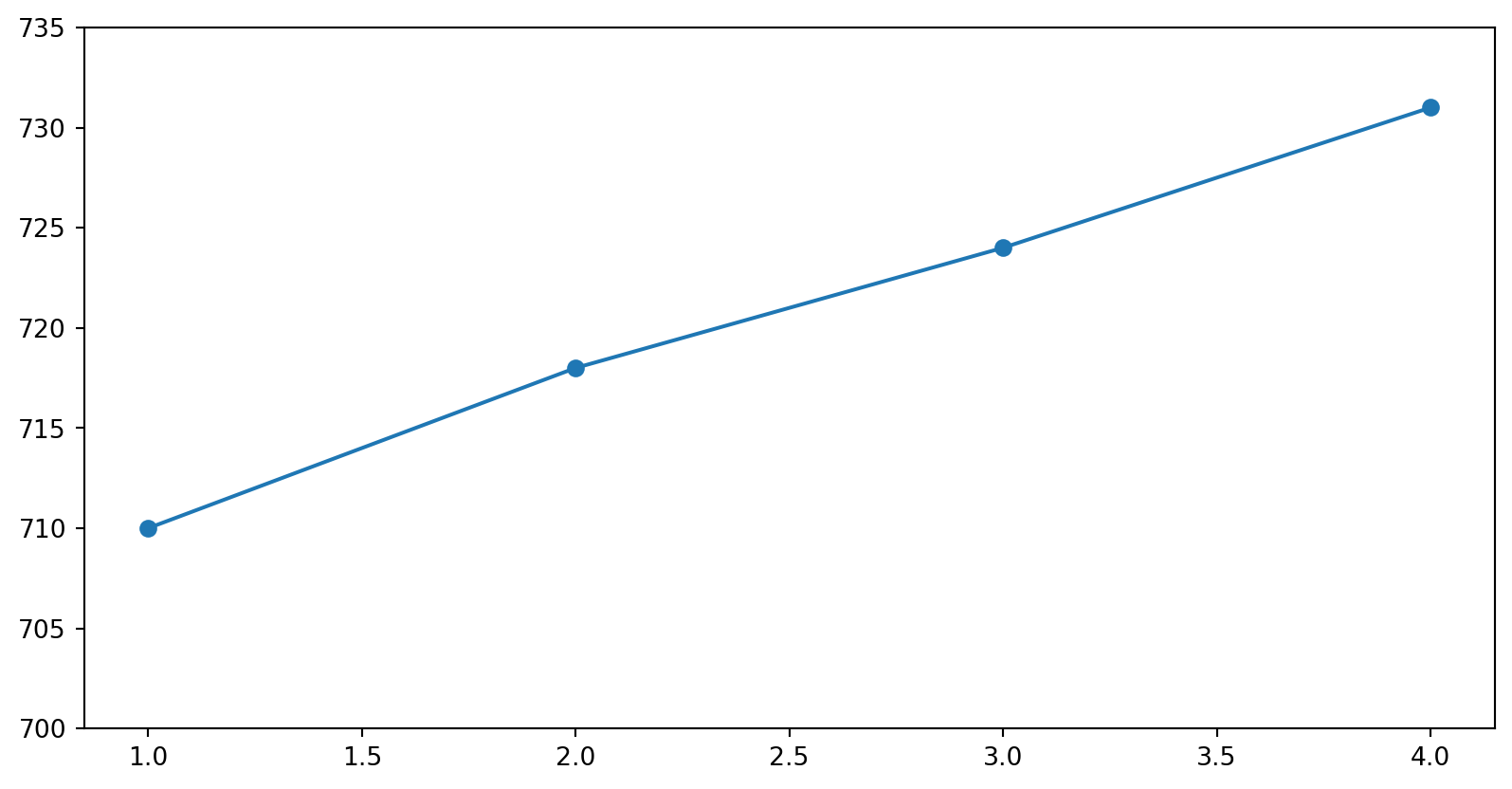
Revenue [710, 718, 724, 731], up 3 % over four weeks. Tobi’s AI drafts the chart and adds one line:
What does the room see?
a) a flat line: 3 % stays 3 % on any axis b) an error: ylim has to include zero on a line chart c) a line climbing almost the whole chart height
Predict. Pick a letter, then I reveal the answer.
Answer: a climb across the chart
c) a climb across the chart: the axis spans 35 units and the line rises 21 of them, 60 % of the picture for 3 % of growth.
Python raises no error and no warning here. The code is fine; the axis is what misleads.
Answer: a climb across the chart
The rule: growth starts at zero
- A growth claim on a chart starts the y-axis at 0. Anything else magnifies a wobble into a cliff.
- The investor will check: she reads the axis before she reads the line.
She’s the type who reads Formular 27b/6 for fun. A stretched axis is the first thing she catches, and the last thing you want to explain.
Your turn
Open the exercise
Scan the QR or type the link:
python.tobiasvlcek.com/notebooks/ex_09_d/

Any questions? Let me know!
AI as your chart assistant
AI is good at plotting code, if you check the result:
- Describe data and question: “I have
orderswith columnszone(text) andtotal_eur(float). Bar chart of total revenue per zone.” - Let it draft the plot code.
- Verify three things before you believe the picture:
- Do the columns it used actually exist?
- Does the y-axis start where you claim?
- Does the chart type fit the question?
AI drafts. You decide what goes on the slide.
Two ways AI charts lie
- Invented column names. The AI writes
orders["revenue"], but your column istotal_eur: aKeyError, exactly the confident-nonsense you caught in Episode 8. Read the code before you run it. - Silently “dramatic” defaults. Ask for a growth chart and some assistants hand back a tight y-axis that flatters the trend: no warning, no comment. The chart runs; that’s what makes it dangerous.
Both threads, one rule: an AI chart runs long before it’s true. You verify the columns and the axis, every time.
Your turn
Open the exercise
Scan the QR or type the link:
python.tobiasvlcek.com/notebooks/ex_09_e/

Any questions? Let me know!
Before Session X
uv, Zed and Mistral Vibe have been on your laptop since Session VII. The finale adds git. Two things before you arrive, about 15 minutes:
- GitHub account from Session I. None yet? github.com, tonight
- git + GitHub CLI (
gh): install, log in once. Git Basics
Do it in advance, and bring the laptop. Session X opens with Checkpoint 5 (Sessions VIII-IX), then builds on git from the first minute. Install fights you? Ask in class or by e-mail.
To the Lab
A chart in a script
The lab is a script, and a script has no cell that could show a chart. So every chart goes into a picture file:
Forget plt.close() and the next chart draws on top of this one: one canvas, two charts. To look at the picture, click daily.png in Zed’s project panel, the file list on the left.
After the break: the lab
- Download
lab_09_pitch.pyfrom Episode 9: The Pitch Deck intopython-labs.orders_messy.csvis still there - Nine tasks, six with a chart. No task names the kind of chart: you pick it. At the end the script puts all six into
pitch_deck.png - Tobi’s deck is in the script too. Two things in it are wrong without any task saying so: one in his numbers, one in what he claims
- No slide covers table to chart: ask your agent, look at the picture
Show me pitch_deck.png and the last block before you leave, for feedback as last week. Then two minutes of practice for Checkpoint 5, which is still handed in from the browser: open ex_09_e, Cmd/Ctrl+S, menu → Download → Download Python code, find the file.
Wrap-up
Three things to remember
- Every chart, one frame. Open with
plt.figure(), close withplt.gca()(in a script:savefig, thenclose); label the axes and title it. A chart nobody can read argues nothing. - Match the chart to the question. Categories → bar, distribution → histogram, two numbers → scatter, time → line. The wrong chart is a lie; and “no pattern” is a real finding.
- Axis from zero, verified code. Growth charts start at 0; check every AI-drafted plot: columns exist, axis starts as claimed?
Season finale next: git and the project kickoff. Install git and gh this week. Session X needs them right after the checkpoint.
Literature
Books to start with
- Wilke, C. (2019). Fundamentals of data visualization: A primer on making informative and compelling figures (First edition). O’Reilly Media. Link to the free book website
- The best single book on why a chart works: principles over code. Highly recommended.
- Downey, A. B. (2024). Think Python: How to think like a computer scientist (Third edition). O’Reilly. Link to free online version
Building charts with AI this session? Revisit the AI Tools page: describe-then-verify is the whole workflow. Matplotlib’s own pyplot tutorial is a friendly next step.
For more, see the literature list of this course.
Lecture IX - Data Visualization | Dr. Tobias Vlćek | Home